Magazine Ad
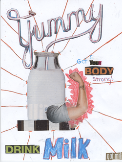
This project was to create and Ad to get a better viewpoint on the elements of color and line. The input factors needed to make this is magizines, paper, glue, scissors, and colored pencils. What we did is figure out what we wanted to do our Ad on, and then once we figured it out cut out peices from a magizine that would go along with the idea. After that we arranged the peices on a paper a few times till we figured out what looked right. The final output was a milk ad to show that milk is good for you and that it will help you get strong. The feedback I got during this was that it doesn't really have a spot that your eye follows. What I did to make it have a focal point is drew lines in that makes your eyes go into the center of the image. That created a place for your eyes to follow. What I learned during this assignment was how to make designs out of ordinary things that you see everyday, it also taught me that there is a reason for all the lines, shape, and bright colrs in Ads or things on T.V., they are all things to pull the viewer/reader in. If I were to do this project again I would definetly do some things differently. What I would do is use stuff I could find on the internet, it would help me in finding more things and different ideas. Having more suplpies to choose from would make it easier to come up with an idea fast and be able to make something better.
Walk For Cancer Flyer
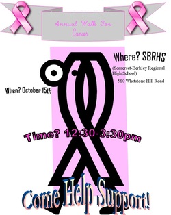
This project was to create an informational but short and to the point flyer. I decided to make mine on a walk for cancer, and for people to come and walk in it. What I did is found some cancer signs from clipart and arranged them in a way to be symetrical and the same colors. When putting in th text I evened them out by putting them on both sides and then larger text at the bottom. When it was finished you see a flyer full of the dates, time, and information about the event. This is a flyer for a wakl for cancer that will will happening nearby. Feedback that I got during this was to add a little more to it because it was to boring. So what I did is added to ribbons to the side of the banner to balance it out and make you eye move around the whole paper. What I learned during this was that you don't want to add to much information because then people will get bored and overwhelmed with it. What you want to do is put just enough information and pictures to get the point across. If I could do this over what I would do is add another picture or to to make it a little more exciting.
What I Learned Today...10/11/11
What I have learned today is to make two flyers on one sheet of paper. Instead of having one big flyer you can split it in half and create two flyers on one paper. You start off by going to print set up, and then choose your height and width that you would like to do for the page size. After then you preview your work to see if it is all fi on the page and ready to print out.
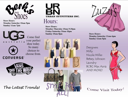
Thayer Street Brochure Flyer(outside)
What we did is made a brochure for Thayer Street. We went to Thayer Street and went around finding different stores to get information on them. My topic was fashion, and I visited all of the fashion stores and got the main information like: the hours. I also asked questions on what they carry and the designers they had. As I finshed the brochure you can see it has different stores and the imformation, and some of the stuff they carry on it. The front is the title and where its located. Then, when you first open it it has a listing of some of the places to go to get the reader to know what their learing about. Lastly, the inside is some of the most popular stores of each subject of fashion; for mens and womens including both clothes and shoes. What I learned from this is that if you balance out everything enough then don's use too much information then the reader can learn a little, be interested, and want to read on more and actually go to what your advertising.
Thayer Steet Brochure Flyer(inside)